INSURWAVE case study: information rearchitecture
Product | UX | UI
PROBLEM/
PAIN POINTS
With our iterative and incremental approach to feature releases, there was a concern that discoverability of information was decreasing.
After doing secondary research (Hotjar recordings), we realised that users were navigating the platform in circles (aka u-turns), especially in one of our most used features - Policy Management.

GOAL
To create a more enjoyable platform user experience that was simple to navigate and to allow users to access information quicker and easier.
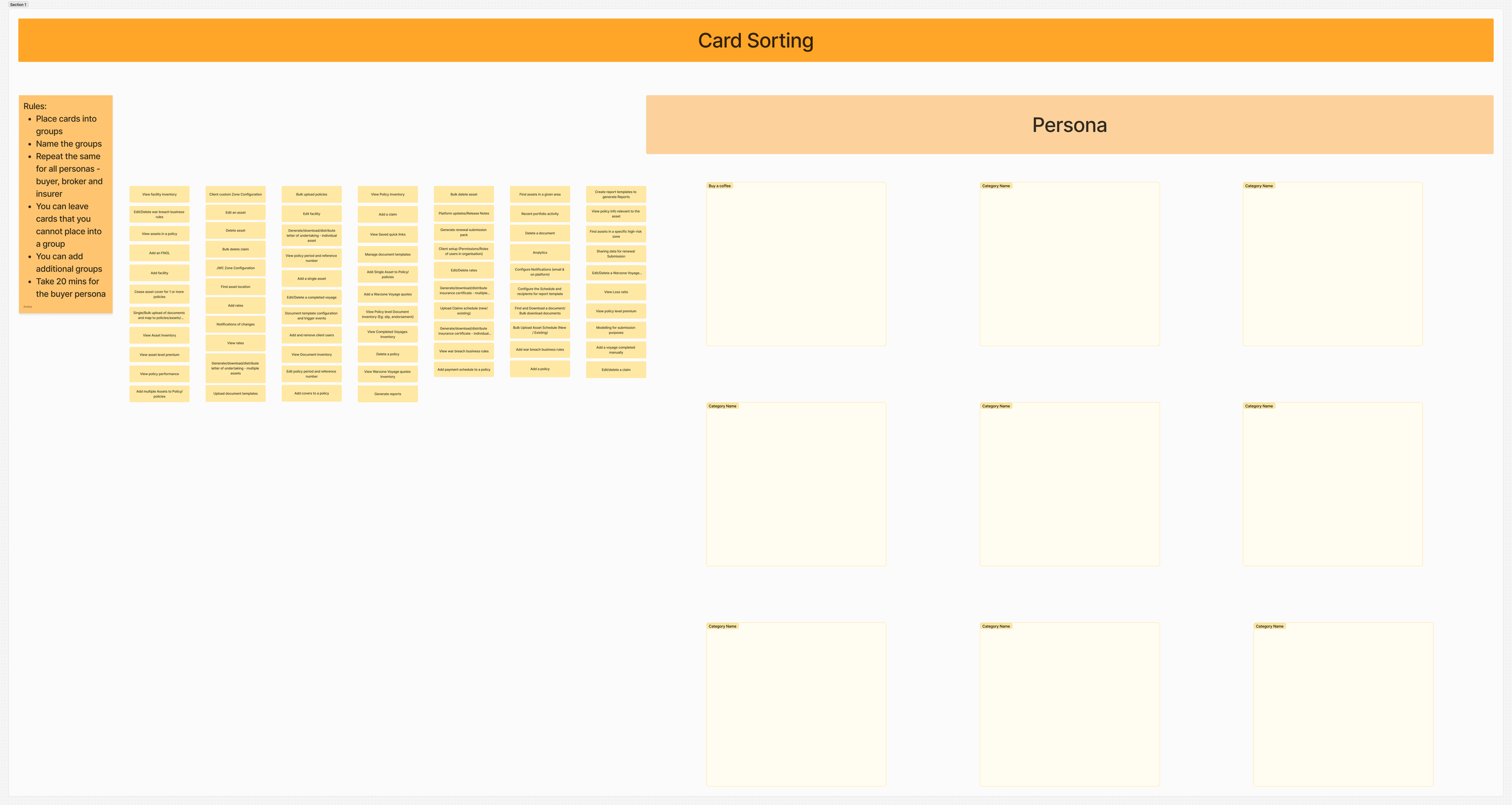
WORKSHOP:
card sorting
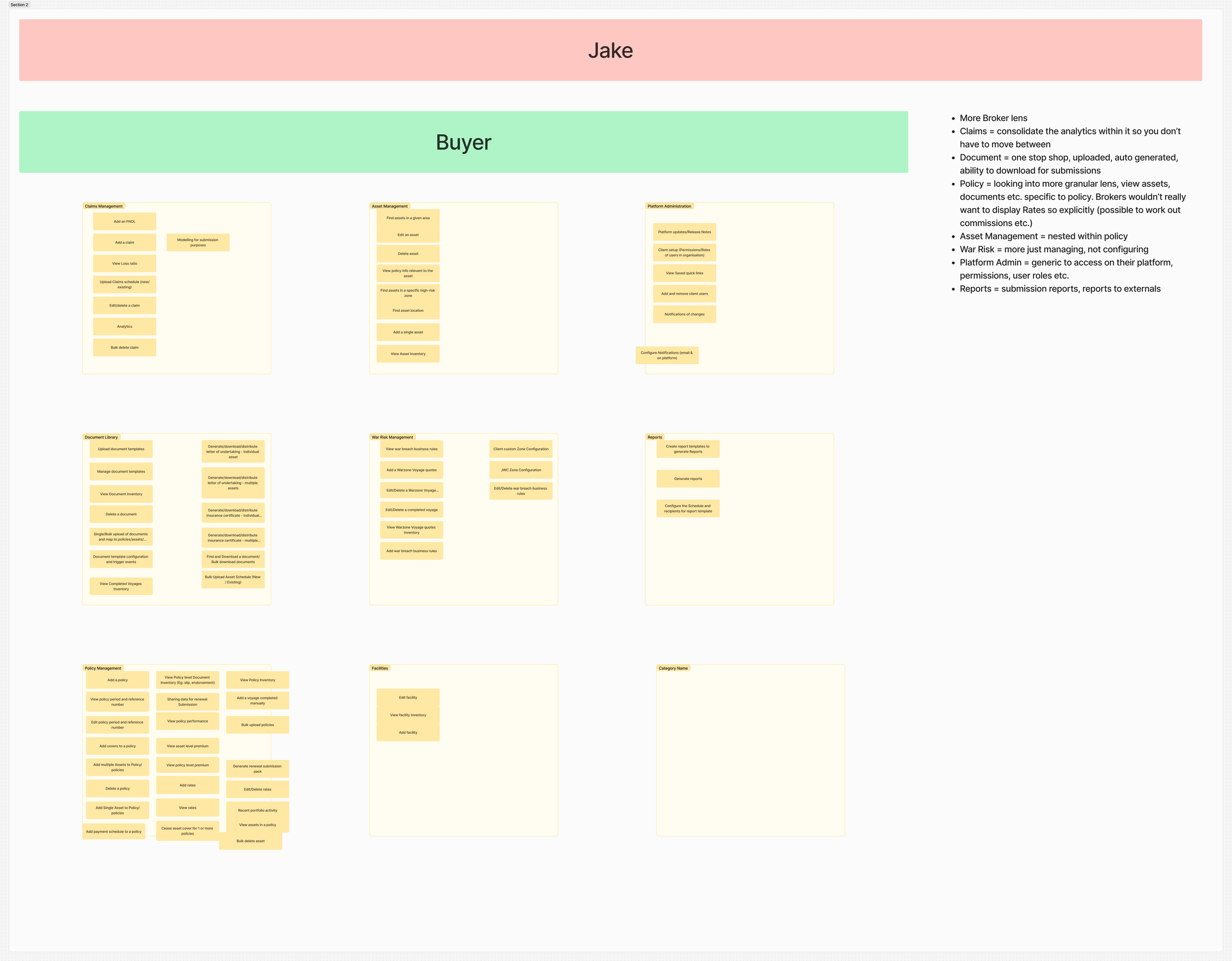
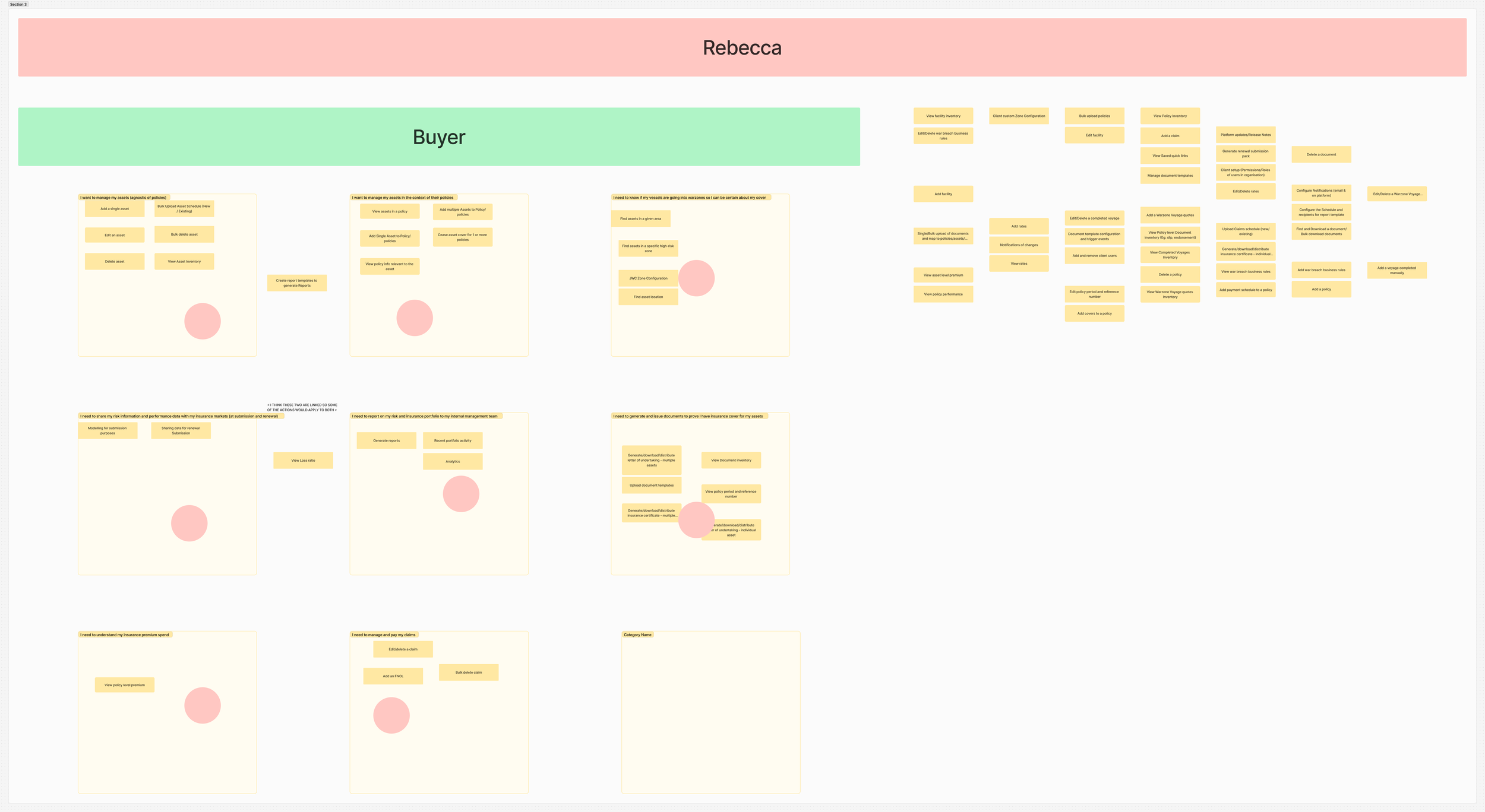
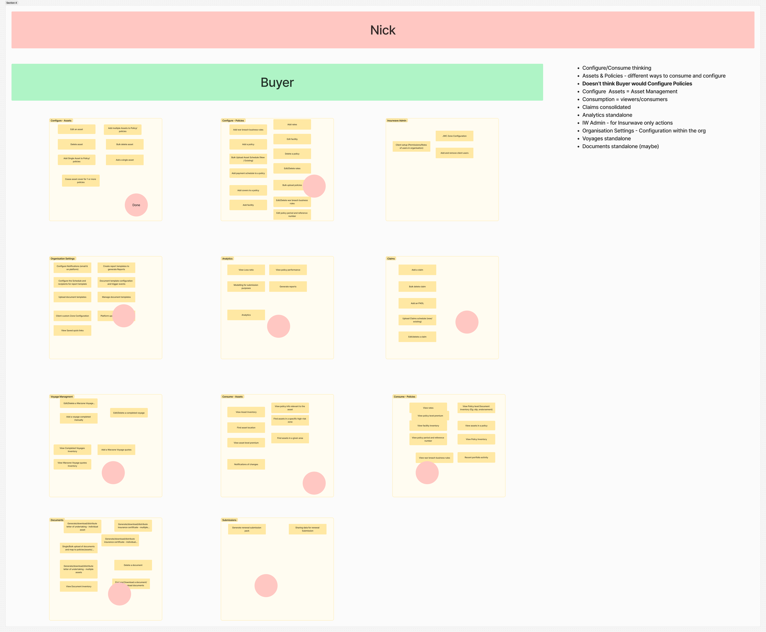
Highlighted all possible actions/flows within our platform and created these as cards
Asked participants to group these actions how they saw fit and then to name these groups
Took the results and grouped themes to create the base of our information architecture
shift & focus
In line with the company’s iterative way of working, we broke down the gigantic rearchitecture of the entire platform into smaller, manageable pieces of work. In turn, we decided to focus on the Policies section as this was what we found in the research as being the most problematic for our users.
IDEATION
DESIGN RESEARCH (BEST PRACTICES), SKETCHING & hypotheses

Hypothesis:
Introducing a new view for information will reduce the amount of clicks for the user to access information of multiple data points.
two-pane view
MOVING PLATFORM NAV POSITION

Hypothesis:
Moving the main platform navigation to the top of the screen, similar to a normal website, will provide more space to display information across the entire platform.
REMOVING POLICY VIEWS FROM THE RISK MAP
Hypothesis:
Creating it’s own designated area in the platform, rather than showing it on top of the interactive Risk Map will allow users to navigate for policy information easier and quicker. This will also allow the use of the full width of the screen, rather than half.

sub ia for policies

Hypothesis:
Introducing hierarchy of information within the Policy screens will allow easier discoverability and create a neater structure for the user to find the relevant information.
WIREFRAMES/
PROTOTYPE
USER TESTING
After conducting some internal usability tests with the wireframes/prototype, we were able to gain some insights into how our designs would hold up with actual users. The tests were conducted with our Client Success team, who work closely with our users on a daily basis and who have a deep knowledge into why and how they use our platform.

results
results
PASS
Users were very happy with this proposed view in our tables, as this allowed them to view multiple lines of the table in more detail, faster. Simply clicking on each line item allowed more freedom of accessibility, rather than navigating back out constantly.
two-pane view

MOVING PLATFORM NAV POSITION
FAIL
After researching into best practices for web app platforms, there was a consistent theme to have the main platform navigation on the left hand side of the screen.
To reduce even more confusion and creating a brand new behaviour, we decided to keep the navigation where it was.

REMOVING POLICY VIEWS FROM THE RISK MAP
PASS
This was the most popular change for this rearchitecture, as many found the Policies being on the Risk Map confusing and unnecessary. Creating it’s own area on the platform allowed for more information to be displayed on the screen, and to create more hierarchy.

sub ia for policies
PASS
This became a natural evolution for the new, standalone Policies section. By creating a sub navigation within a policy, users were able to find the relevant information easily and quickly, rather than trawling through large segments of information to find something.

HIGH FIDELITY DESIGNS
Working closely with the Engineering team and Product Owner, we successfully created this new Policies section for all lines of business, deprecated the old views from the Risk Map, and rolled out the new designs to all clients.
OVERALL RESULTS
OVERALL RESULTS
To better align our results to business objectives, our planned NPS surveys fit perfectly in gauging sentiment of the platform before and after the changes were to be implemented.
November 2023: 49
February 2024: 54
NPS SCORE
In our initial research, we found that over a 3 month period prior to the redesign being released, 33% of sessions that included Policy management had 2 or more u-turns.
After the redesign was implemented, we found that over a 3 month period, 16% of sessions that included Policy management had 2 or more u-turns.